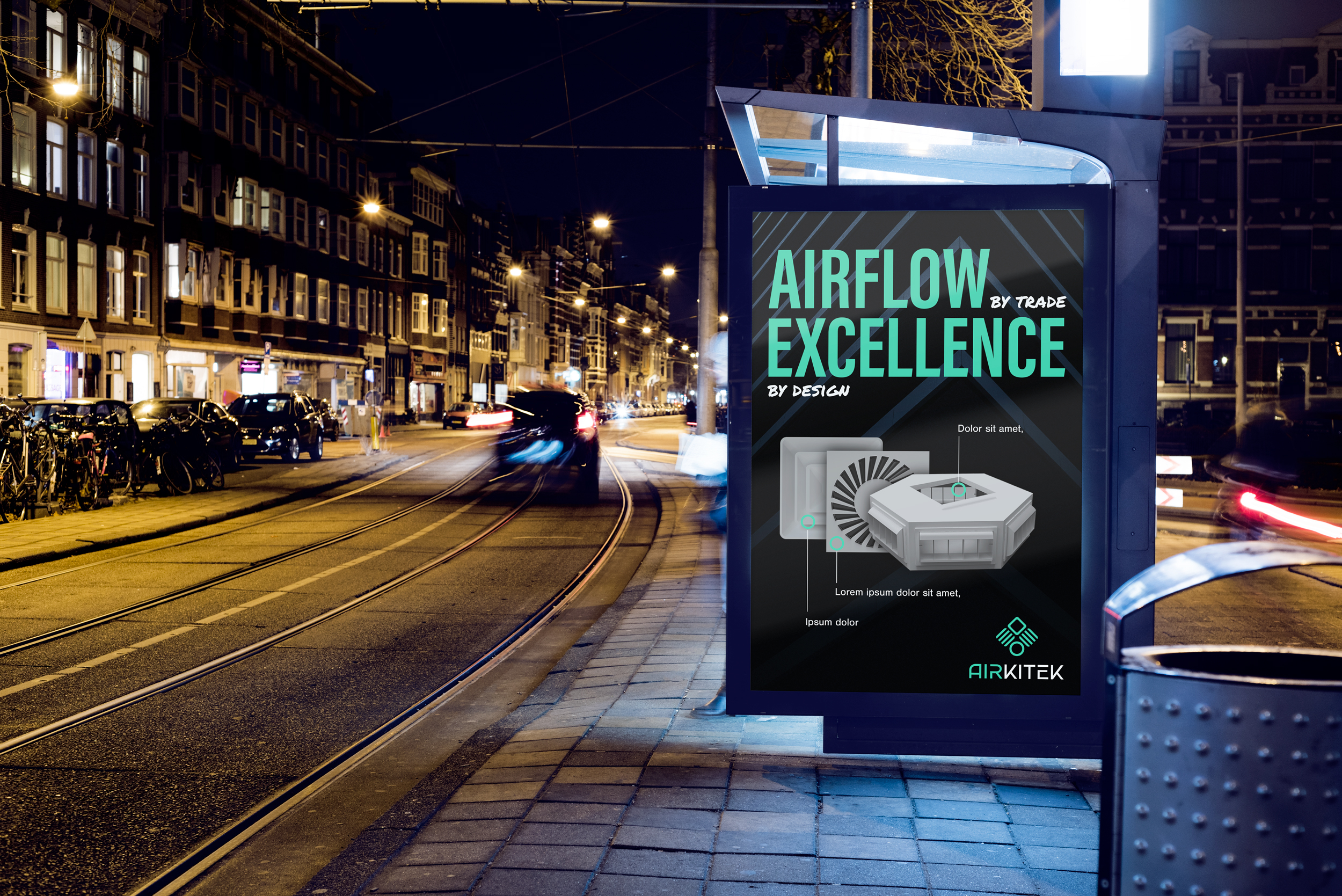
Introducing Airflow Excellence from Mexico to the world.

Grupo NAMM is Mexico’s largest manufacturer of air distribution equipment for HVAC systems. Founded in 1976 and headquartered in Monterrey, the family-owned company operates from a 60,000-square-foot facility with more than 190 employees and holds approximately 30% of the Mexican market across grilles, diffusers, louvers, dampers, and filters. Airkitek was created as NAMM’s international brand, giving the company a distinct identity for expansion beyond Mexico while retaining the credibility of its established parent company.

In early 2020, Grupo NAMM decided to expand into the United States. The company arrived with 44 years of manufacturing experience, an established product line, and a significant share of its domestic market. The problem was that almost none of that equity traveled with the NAMM name.
To an American contractor encountering the company for the first time, a manufacturer with 30% of the Mexican market could look much like one with no track record at all.
The project therefore went beyond redesigning NAMM’s visual identity. We needed to create a brand specifically for the international market, one capable of introducing the company on its own terms while still carrying the credibility of the manufacturer behind it.
The result was Airkitek by NAMM, an endorsed brand built around a new strategic position: the architects of airflow.
That idea informed both the name and the tagline:
Airflow by trade. Excellence by design.
The name came directly from the role NAMM’s products play in a space. They determine where air goes, how quickly it moves, how quietly it arrives, and what the opening looks like within the room. We saw that as an architectural responsibility.
Airflow, designed.

“We didn't think our previous brand identity reflected the quality of our products. We needed a brand that would resonate with our clients and would differentiate us from our competitors.” - Abraham Alarcon, International Business Development Manager
The central challenge was simple: NAMM was proven in Mexico but unknown in the United States.
The company had the manufacturing capability and history to compete internationally, but it lacked a clear understanding of the American buyer and a brand that could communicate its value within that market.
Our goals were to:
We also needed to protect the equity NAMM already had in Mexico. Rather than replacing the existing brand, we developed an endorsed architecture. Grupo NAMM would remain unchanged in its established market, while the international division could operate as Airkitek by NAMM.

We began with a competitive brand audit of Titus, Price, Krueger, Nailor, and Soler & Palau, evaluating each across brand messaging, positioning, personality, visual identity, website and UX, and customer reviews. We expanded the visual analysis to include Seiho, Trox, and Tuttle & Bailey and supplemented the research with a working session with NAMM leadership and buyer-persona development.
The category showed significant convergence.
Three of the five primary competitors held no particularly distinctive or defensible position. The two that had created stronger differentiation had largely done so through proprietary software rather than the product itself. Four of the leading brands relied heavily on blue, imagery was dominated by product photography and generic stock, and two competitors lacked mobile websites.
The buyer research revealed the opportunity.
Our primary persona was a roughly 40-year-old lead project manager at an HVAC contractor: organized, time-poor, and looking for products that performed well, looked good, and came at a reasonable price. His major frustrations included long lead times, pricing that didn’t match perceived quality, and suppliers that prioritized only their largest customers. Price and service quality were his strongest purchase drivers, but his affinity for brands such as Volvo, Apple, and Banana Republic also suggested an appreciation for thoughtful design.
That led to the central strategic insight:
The category had converged on the same features, voice, and visual conventions, while almost nobody was competing meaningfully on design. The buyer, meanwhile, clearly noticed it.
From there, we developed the concept of the architects of airflow and explored multiple naming, tagline, and visual directions before selecting Airkitek.
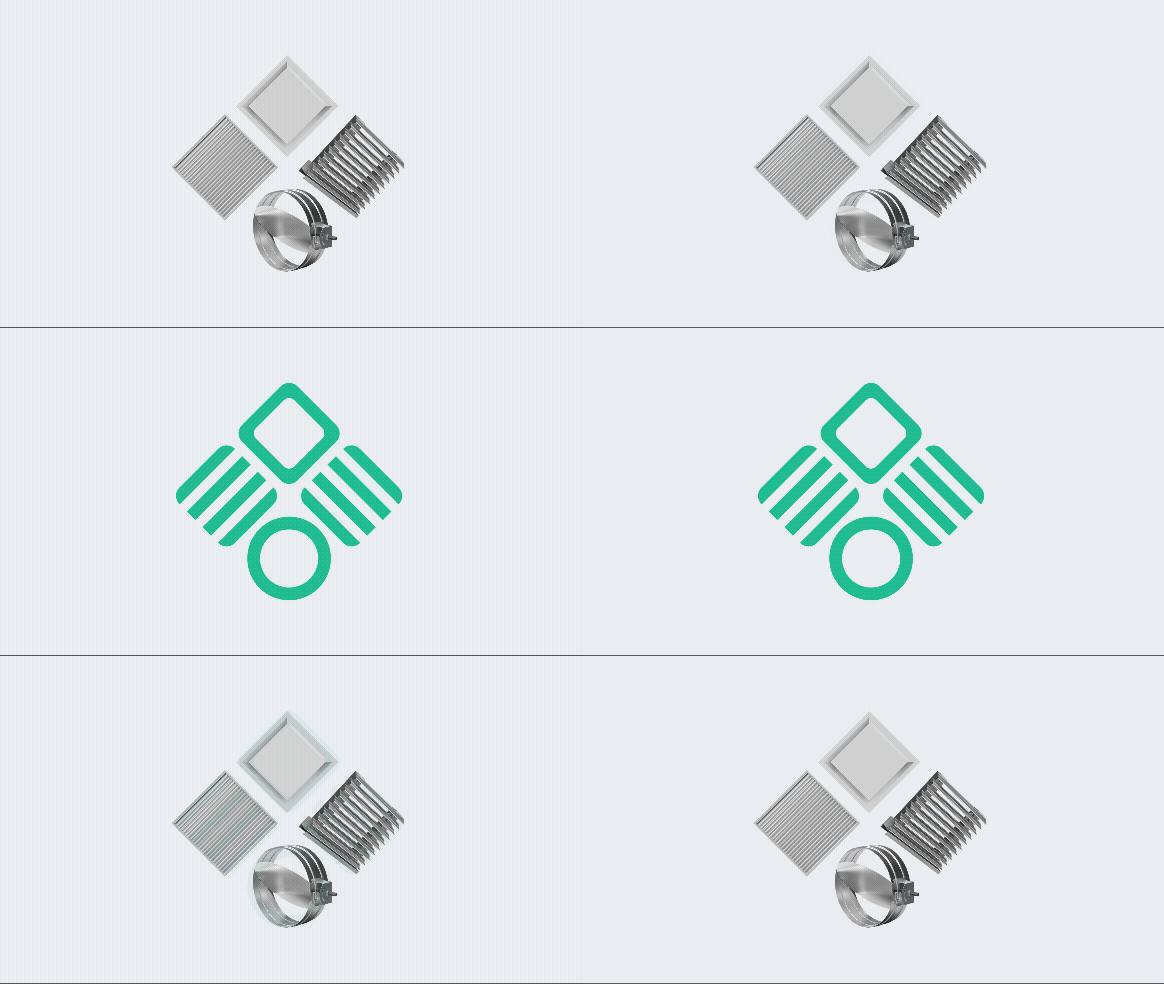
The final identity was built around a symbol composed of four elements representing the company’s primary product categories while resolving into the form of an eagle. The guidelines also connect the icon to the broader brand vision of airflow moving through the built environment.
Before arriving at that solution, we explored several other visual territories, including geometric monograms, architectural forms, circular airflow systems, and symbols based on mechanical movement. Those explorations helped establish the balance the final mark needed: technical without feeling cold, architectural without becoming literal, and distinctive enough to separate Airkitek from the category.
The final mark was refined using geometric construction based on squares, lines, and circles. The wordmark was built independently, modifying Gotham Regular to better match the weight and character of the icon.
Color became another opportunity for differentiation. Instead of using the light blues common throughout the category, we developed a primary palette of Steel Grey, Fresh Mint, and Feather Grey. Steel Grey referenced both metal and technical authority, Feather Grey drew from architectural finishes and space, and Fresh Mint represented airflow while giving the company a recognizable accent color.
The typography system used Nimbus Sans for body copy and smaller subheadings, Acumin Pro Extra Condensed for headings, and Permanent Marker as a limited accent typeface.
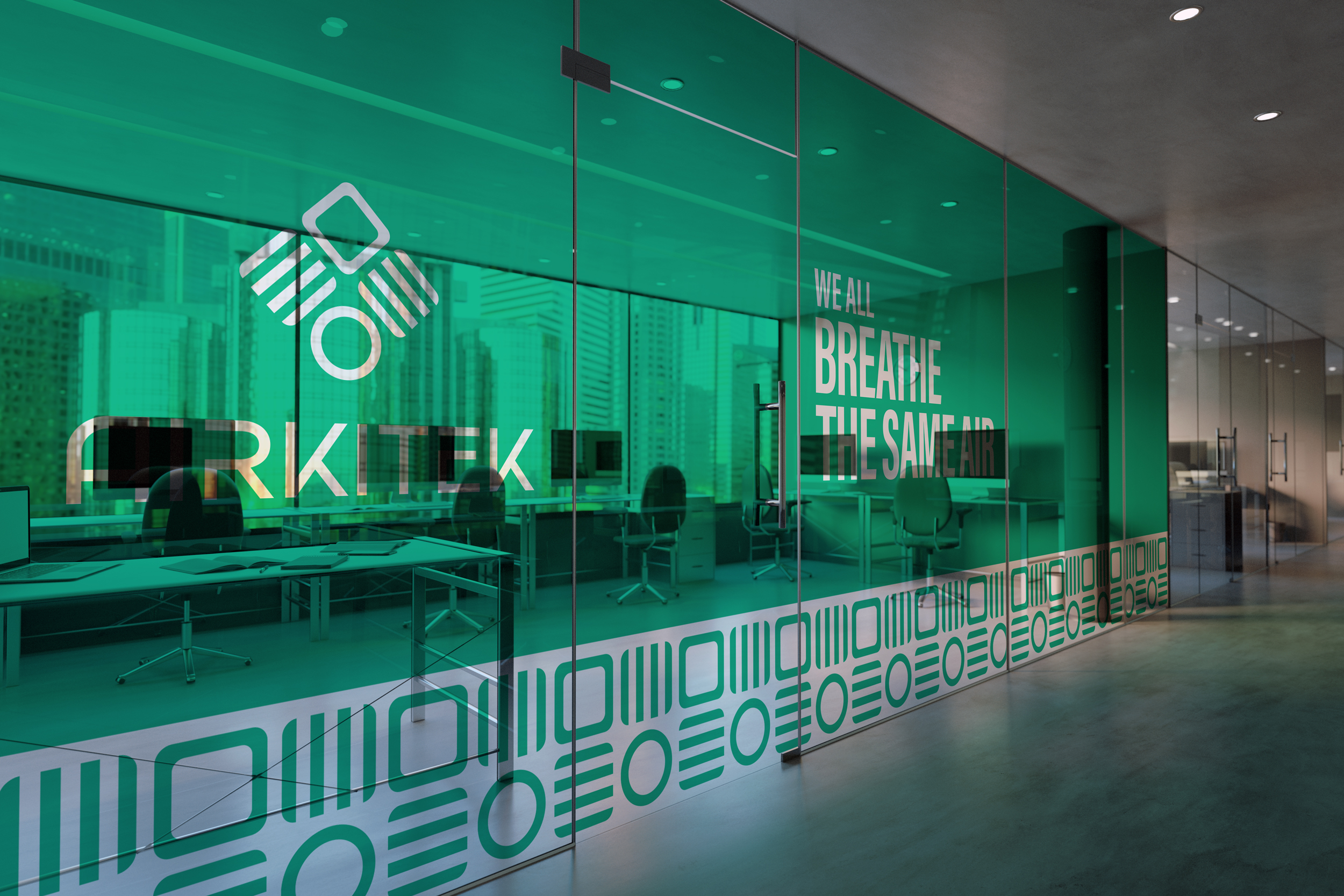
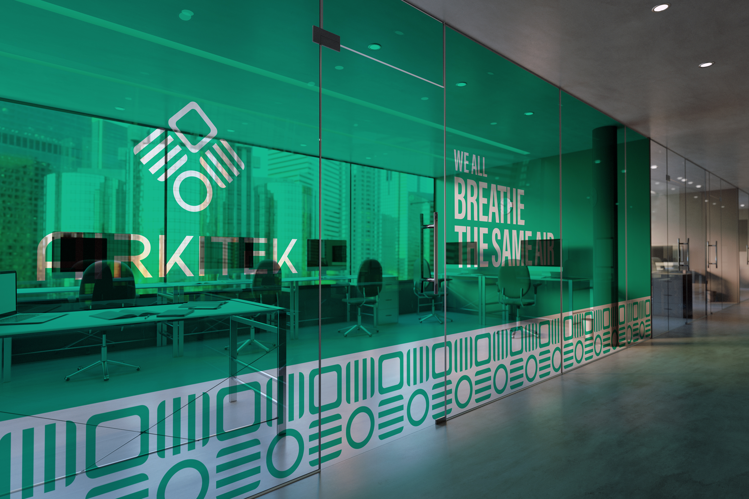
The identity was then developed into a complete operating system covering logo configurations, spacing and sizing rules, typography hierarchy, primary and secondary palettes, graphic patterns, stationery, and image treatments. The guidelines include applications for letterhead, envelopes, and business cards, as well as a photography system using Steel Grey overlays and the Airkitek pattern.
The project ultimately delivered brand architecture, positioning, mission, vision, values, buyer personas, naming and nomenclature, communication guidelines, the logo system, visual identity, and comprehensive brand guidelines.


Airkitek launched in the United States in 2020 with a new name, tagline, messaging platform, positioning, and complete identity system built on a strategic foundation.
The project gave Grupo NAMM something it previously lacked: a brand capable of introducing a 44-year-old Mexican manufacturer to an international audience without asking that audience to already understand the significance of the NAMM name.
The new identity separated the company visually from a category dominated by similar colors, imagery, and messaging, while the Airkitek by NAMM architecture allowed the international brand to establish its own position without abandoning the history behind it.
The result answered the original brief: create a brand that reflected the quality of the product, differentiated the company from its competitors, and gave NAMM a consistent way to communicate what it did and why customers should choose it.
“The Osadia Studio communication and design frameworks gave us all the tools we needed to clearly and consistently tell our customers what we do and why they should buy from us. - Abraham Alarcon, International Business Development Manager

Image = Unmissable
Offer = Unmistakable
Value = Undeniable
Experience = Unforgettable
Culture = Unshakable
Brand = Unstoppable