Carrco Painting
This contractor needed a fresh coat of paint to become a nationwide powerhouse.
.png)
Client Description
CARRCO Painting is a Dallas-based commercial contractor with over 30 years of experience delivering large-scale painting, drywall, and flooring projects across Texas and beyond. With 500+ employees, $50M+ in bond capacity, and a portfolio that includes some of the most recognized construction projects in the country, CARRCO is built for the big jobs.
Project Details
Overview
CARRCO Painting is a Dallas-based commercial and industrial contractor specializing in painting, drywall, and flooring across large-scale construction projects. With over 30 years in the industry and partnerships with some of the biggest general contractors in the country, CARRCO had earned its reputation on the job site. The brand just hadn’t caught up.
Osadía Studio led the full engagement, transforming CARRCO from a respected local operator into a brand capable of competing at a regional and national level.
.avif)
Challenges
Reputation held back by identity. CARRCO came in asking for a website redesign. Discovery revealed something bigger.
The existing visual identity felt generic and dated — more in line with a small local crew than a company managing enterprise-level contracts. On a job site, their work spoke for itself. Everywhere else, the brand was invisible. It couldn’t walk into a GC’s office and command the same trust as the work it represented.
What started as a digital project quickly became a full rebrand. The opportunity was clear: align CARRCO’s identity with where the company was headed, not where it had been.
Project Goals
- Improve brand recognition across all touchpoints
- Elevate perceived professionalism to match enterprise-level clients
- Create consistency across digital and physical applications
- Showcase project work more effectively through better UX
- Position CARRCO for regional and national growth
Concept and Creative Direction
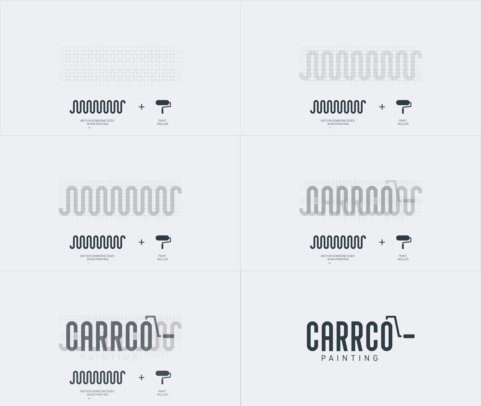
The central concept came from the craft itself. When you watch someone paint a wall with a roller, there’s a rhythm to it — a repetitive up-and-down motion that’s both mechanical and fluid. That motion became the foundation of the identity.
The custom wordmark was built around that wave: each letterform mimics the natural arc of a roller stroke, creating a sense of movement and rhythm across the name. The “O” was engineered into a paint roller in mid-stroke, making the logo feel like it’s actively applying itself to whatever surface it touches.
The result is a mark that reads as strong, premium, structured, and hands-on — confident without being flashy. That combination was intentional. CARRCO needed to feel credible in a boardroom and legible on a hard hat. The identity had to work both ways.
.avif)
Design System
Three colors. Each with a clear job. Gotham Grey (#313E46) is the primary. It carries the authority of the brand across every application. Lagoon Rock (#25CED1) is the accent that highlights, directs attention, and adds a distinctive energy without competing with the work around it. Maui Mist (#EDF0F2) handles backgrounds and breathing room.
The dark neutral palette was a deliberate choice. CARRCO's project photography is the most compelling proof of their work — the brand system needed to stay out of its way.
.avif)
Website Redesign
The old site was functional but flat — it didn't tell the story of a company that had painted over 2,000 buildings and counting. The new site was built to do that job.
Services are presented with clarity and depth, covering coatings and wall coverings, drywall, floor coatings, and facility maintenance — each with enough context for a GC or project manager to understand exactly what Carrco brings to the table. The portfolio puts the work front and center, organized by project type and backed by contract sizes, client names, and locations that speak to the scale of what the team delivers.
Safety gets its own dedicated space on the site, because at CARRCO it's not a footnote — it's a core part of how they operate. The site communicates their zero-accident goal, their OSHA training programs, their on-site safety directors, and their 100% self-reporting model with the same weight as any service page.
The CARRCO community comes through in the blog, the careers section, and the team directory — giving the brand a human dimension that goes beyond the job site. Industry awards, GC testimonials, and certifications are woven throughout to reinforce credibility at every scroll.
.avif)
Execution
A brand identity only earns its keep when it holds together across every context. For CARRCO , that meant going far beyond the screen. The mark was stress-tested across hard hats, polo shirts, t-shirts, vehicle wraps, water bottles, caps, business cards, and branded stationery — and it looks as confident on a job site as it does in a proposal. Large-format applications like billboard concepts and office wall murals proved the typographic system could scale dramatically without losing impact. The wordmark and tagline hold their own at any size, and the dark palette keeps things bold in outdoor contexts.
.avif)
.avif)
.avif)
.avif)
.avif)
.avif)
.avif)
.avif)
.avif)
.avif)
Outcome
Since the rebrand, CARRCO has seen sustained, measurable growth across the business. The unified identity gave the company the visual authority to compete for larger commercial contracts. They maintained 30% steady growth over five years since the rebrand. Stronger brand consistency across all platforms. Improved positioning for larger commercial opportunities at a regional and national level. Increased trust and credibility through a unified, professional visual presence.The rebrand helped transform CARRCO from a respected local contractor into a brand capable of competing with the biggest players in the industry — and winning.
"From day one, Gialli Marketing had the right recipe to help us achieve our goals. Since the rebrand, we've seen a steady 30% growth over the past five years, thanks to the consistent image we present across our digital and physical platforms." - Javier Huerta, Founder & CEO — CARRCO Painting
.avif)



Our Standard
Our Standard
Every brand we create must achieve these six criteria:
Image = Unmissable
Offer = Unmistakable
Value = Undeniable
Experience = Unforgettable
Culture = Unshakable
Brand = Unstoppable